Tuesday, December 6, 2011

Nutrire l’anima.

Nutrire l’anima.
Nutrire l’anima: A4 Debossed Print

This has been a common theme of mine this holiday season: Feed Your Soul. The trick is to find the right words in Italian. In this case, the translation is practically verbatim. This limited ed. print was created for Christopher+Columbus latest event at “La Meridiana Tempo” local bookstore & cultural arts center in Mondovì.

Sunday, November 13, 2011

Christopher+Columbus: ‘Grammatica Cromatica’ at La Meridiana Tempo

I’ve lately been tapping back into my Adobe skills designing posters for Christopher+Columbus, local art shows my photographer friend Kate Trafeli and I have been doing. Mind boggling how fast things are on my Mac compared to my manual press. The satisfaction is comparably good I must say though.

For this show, I’m introducing more stationery products. Art prints are fun, and I think I’ll continue to do ‘one-offs’, but I have a heart of a designer and function is just super sexy to me.


Grammatica Cromatica_poster designs

Grammatica Cromatica_poster designs

Monday, October 17, 2011

(formula) Guzzi + Burrata mozzarella = Happiness

I am coming up on a year of my adventure in letterpress which meant finding a press, materials, a guru and tons of hours (giving up my summer holiday) to learn how to PRINT (not talking the digital kind either). I think inspiration came twofold when my home printer just wouldn’t (couldn’t) render my designs to their full capacity, and when I couldn’t (but tried) to get a short offset run of my thesis from a local printer. In the end a kind service bureau printed it up on a laser printer with a cloth cover.

In Italy, the best design is pushed to its full and sensory extremes. Let’s take for example the designs of Moto Guzzi and Ducati motorbikes or, (needless to mention) a Ferrari at once in the rear view mirror on the costal highway zoom by or the vintage Fiat 500 creeping up along side you from the opposite direction at 50 kph is a delight. And of course food...cut into a mozzarella burrata is just as good as biting into it. It is design thought through at every point of intersection. The best experiences I think are ones that cultivate happiness and strive to engage all life affirming senses.

So, fast forward one year and I’m having my first photopolymer experience: a wedding invitation which is essentially a two color image of bride and groom embracing, id est registration heaven. This design only revealed its full capacity after all the components had been put together i.e. setting up my form, mixing up paint, pressing into that lovely Magnani paper and set to dry. The design experience made whole...


CIMG0006_2 CIMG0008
metal plates: bride&groom and sage wreath

L&M_detail
photos of finished product. paper is ivory in fact.

Saturday, October 8, 2011

Christopher+Columbus: Sensory Treats

nobliss
Christopher+Columbus “Grammatica Cromatica” featuring letterpress & art photography.
All Photography by Kate Trafeli

Print in all its varying forms, I think, will be designated as sort of an esoteric art form one day, and so, one will have to find a mentor or teacher to learn its power of expression. This power of expression being the dynamism and impact ones mark on a piece of paper can extend. Could it actually make us closer after all? Does it close the gap in a way the internet can’t do? As objects and technologies become relics (or things forgotten) over time, human contact shouldn’t.

wine docg

7th October I participated in a collaborative art project/event with the very talented artist and friend Kate Christopher Trafeli. And print did, what print does: extend itself physically. The aim was a sensory event for the community, friends and family and included amazing tastings by chef Marc Lanteri of Baluardo and music by memebers of the local group The Clips.

Camera Roll-1690
members Mark Trafeli on guitar & Jack Hard on contrabass from "The Clips


Monday, September 19, 2011

Feed Your Soul///art cards

Count down for a mini launch party/art show a friend and I are having. It’s been great fun working with Kate and I think it’s going to be smashing. Last week I worked on a series of art cards: Think-Eat-Love. Here’s a sneak peak.

CIMG0037

CIMG0027

Tuesday, September 13, 2011

What words bring to mind...

Smashing Pumpkins were a great reference point as an awnry teen and still as a more gentle adult. Some of their lyrics have a soundness on such a basic level. I'm striving for this simplicity and honesty with words and their meanings on my latest print projects. 

I think Picasso's words ring most true when he said it took him a life time to draw like a child. 

Soundess: noun

1. a state or condition free from damage or decay.

2. the quality of being prudent and sensible.

3. the muscle tone of healthy tissue.


(wordnik.com) 

Saturday, September 3, 2011

Summer Ramblings///Pt.2

Well, it’s now at the end of summer, and between my first summer rambling post and this one, I’ve been busy busy busy planning away on a collaborative letterpress and photographic project with photographer/artist Kate Trafeli (more to come)!

And...I’m working on my first wedding invites! Wow, this is going to be a feat. Having stated in earlier posts that materials are harder and more expensive to come by in Europe, unless you devise your own. I’ve been all over Europe for material, but without leaving the comfort of home (the wonders of Internet).

balloons 3
Balloon letterpress prints in varying colors. Don’t have a top quality camera (next years budget),
so the colors are a bit off. Still, I’m happy to have done an image that represents my town!
Viva homegrown!

Wednesday, August 24, 2011

Motion Graphics

One of my many hobbies is playing around with my video camera. Absolutely great how still graphic images can become a moving picture to create a story line. Kate Spade’s blog this month had a nice collection of work by graphic designer Saul Bass used in movie title sequences. I’ve added this one as a personal favorite. Striking how these super low-fi effects could be so eye catching and clear in intent.

Monday, August 22, 2011

Poesia Pirouette

"Some say existence like a Pirouot
And Pirouette, forever in one place,
Stands still and dances, but it runs away;
It seriously, sadly, runs away
To fill the abyss's void with emptiness."
Robert Frost (1874–1963), U.S. poet. West-running Brook (l. 50–54). . .


bird feeder

Wednesday, August 10, 2011

Caffé Italia

In Italy I am constantly reminded of the tremendous beauty that abounds, however sometimes suffocated by our own reluctance to go slow. Which brings me to one of the things I remember most about being at college was “going slow”. This was done with daily rituals of popping into and lingering in cafes, thumbing through books on shelves left there by some other, riding my bike to the next location, passing over bridges and through parks to the next cafe.

So, this may be the “why” I’ve decided to get into letterpress.

Found this nice article on great Louise Fili speaking about her Italian roots and coming here twice a year to get her mojo on. Her latest project was to collaborate with Rizzoli Publishing to create book cover designs on some of Italy’s most renowned novels to celebrate 150 years of Italian Unification. "I wanted the books to have an authentic yet timeless look, approximating the feel of a custom letterpressed hardcover book with a cloth spine.” Louise Fili
http://www.lanciatrendvisions.com/en/259/interview-with-louise-fili

bur_13


Wednesday, August 3, 2011

“Punchy & Beautiful” Typonine

I like the feel of this Croatian type [faun-dree], Typonine
Nothing dry about how they visualize typographic form and transmit it into content.

tn_tp_large_1270674165-0-my-ph

My Philosophy (Monty Python) Nikola Djurek

typographic posters at www.tipoplakat.com by Nikola Djurek, Peter Bilak, Hrvoje Živčić & Dario Dević

tn_tp_large_1283711518-0-allow

Mistakes///Peter Biľak

Steven Heller’s article on Djurek & Hrvoje Zivcic’s graphic work /// http://tmagazine.blogs.nytimes.com/2011/08/03/graphic-content-typonine/

Sunday, July 24, 2011

Nebiolo /// Flea Market Find

This summer has been dedicated to setting up my home print studio and working on fun print projects for the fall. Sunday morning's bike ride took me smack into the monthly "mercatino delle pulci”. And as the story goes, from across the square, WAM! I came across this much needed (and restored) beauty of a type cabinet, but what makes it such a designer’s find is that it's from the now defunct type foundry Nebiolo ( mid 1800’s -1970’s), once located in the industrial north of Italy, Turin. Amazing type designers such as Aldo Noverese and Alessandro Butti were known to collaborate together and contribute for Nebiolo.


dual


Monday, July 11, 2011

Vespa Woodblock Print

If you hear a summer buzz, it’s probably not the crickets around here, but the sound of motorbikes abound. It’s a favorite subject around here, as I’ve been experimenting with Vespa woodcut blocks for printing.  This one was printed with patriotic blue and red on Fabriano Rosa Spina.


Here’s another wonderful personalization of Vespa--a one day getaway to Ortovero Liguria, we captured this baby. Who would have ever thought of a real papier maché Vespa! Yes, it exists and I want one!

Papier Mâché  Vespa


Thursday, June 30, 2011

Italian Style (Stile Italiano) Letterpress Studio

CIMG0240
dualpic
Alessandro Zanella’s very cool studio.

This post is long overdue by the way. In early spring I was invited for an informal gathering in a little village called Santa Lucia ai Monti in the province of Verona, Italy. Alessandro Zanella lives and works here from his studio, and is an interesting figure known for his 1854 Stanhope handpress which he prints limited ed. books from.

So, before the relatively small group of 30 interested headed off to lunch in a nearby risto, we had the chance to check out his studio and have an apèritif (my one clearly demonstrated in the photo above). Having started my own printing lab at home, I love looking at other people’s workspace and what makes them tick. I also marvel at the massive organization a printer should have which, I think, reflects on the work they produce.

Friday, June 24, 2011

Weekend Rambling | Summer: Take 1

CIMG0036

Summer is here and I’ve managed to get lost for hours in my home print studio. Here’s to the first week of summer! Biking, parking and enjoying a nice breeze in a patio garden somewhere.

Saturday, June 18, 2011

Slow Food Celebrating 25 Years


Today I spent with Slow Food (promoting local and seasonal food traditions) volunteering and partaking in the events organized for the community where I live. In actual fact, this event took place in varying degrees in 300 squares all over Italy.

Everything kicked off before lunch in a little gallery where some of Slow Food’s magazines and covers were blown up and exhibited (I quite like their food photography and layout for their publication). One of the founding members of Slow Food was there to share how his hobby as a photographer developed into something more serious even if Slow Food is a non-profit organization.

Later in the afternoon presidia (to help promote local artisan food production), a sensory education (adult and children blindfolded to guess what they smelt or tasted) and general information booths were set up. My role today was to pass out flyers to people who were at best very keen or in the least interested in (slow) food. During my stint as volunteer I encountered a 9 year old girl, daughter of one of the salami producers, who was more than happy to help pass out flyers, and before I knew it my huge stack had dwindled.


Monday, June 13, 2011

Paper Cut

Played with i-movie this morning and put together a super mini (35 sec. footage x 3) with my darling 3.5 megapix camera.

Paper cut: French handmade 100% rag ///Arches paper

Sunday, May 29, 2011

What headlines were made of // Wooden Type

(super dirty BEFORE picture)

This morning I begun cleaning off the layers of dust from my wooden letters bought from a defunct print shop in a nearby town. It closed doors almost two years ago after having been open roughly 100 years. When I had first started looking for a press, I had initially gone there to see if there was anything to be had. On that visit I noticed cases of wooden letters pretty much forgotten. Six months later I made another trip back.

During my visit the ex-printer shared a piece of the print shop’s history. He opened up one of the old local newspapers he had put away in a protective cover dating back to 1924. What stood out most to me was the fantastic handset non standard type used for headlines. Nothing classic or identifiable about the font; it was ballooned and pinched tight at the end to create its serifs like a bouncing elephant with tiny feet. Flipping through the pages, he showed me an advertisement for the print shop similar to their ironwork signage still hanging under the arcades of the main street. Then the book was closed and I was shown the cases of wooden type for sell.

(super clean AFTER picture)

Back at home wiping off grunge, I noticed fonts with accents (curious to an American girl) and letters like j, k and y that were much newer since they aren’t formally part of the Italian alphabet system, but have been brought into usage in very recent decades as these letters are too.


Friday, May 13, 2011

Letterpress Basics: Composure On A Stick

So the cool thing about the basics to hand setting type is it requires composure (meaning patience and organization) and, in my opinion, helps one appreciate the craft of letterpress that much more. Here are some of what you need to get started and a simple visual guide on how to hold your composing stick before you compose your first lines of type.
AT MY LETTERPRESS WORKSHOP IN PARIS WITH THOMAS GRAVEMAKER
LEARNING THE BASICS

Friday, May 6, 2011

The shingle best thing about Austria

Recently we had the chance to stop at some friends' house in western Austria coming back from picking up my press. Strewn along the valleys of Switzerland and Austria were wooden chalets with steep pointed roofs. Historically, these affectionate buildings were built with economy and function in mind to keep warm during the alpine winters, and used seasonally as huts by cow herders to make food products like milk and cheese.

It was a pure inspirational color pallet of bright but subdued weather worn window frames and shutters against shingled exteriors. What a pleasant surprise to also find many restored buildings or new homes reflecting traditions of the past but with modern interpretations. Cafe Cabako was one of those really cool buildings with not just coffee in mind, but also bakery and practice music room upstairs that our architect friend Christian had a hand in. Definitely and exactly what I was looking for in terms of direction on designing of my own home studio...

Friday, April 29, 2011

Osmosis :: Erik Spiekermann


Osmosis: // What do Spiekermann, Hobo and Schwinn have in common?
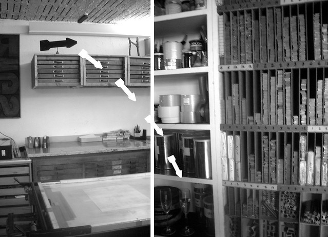
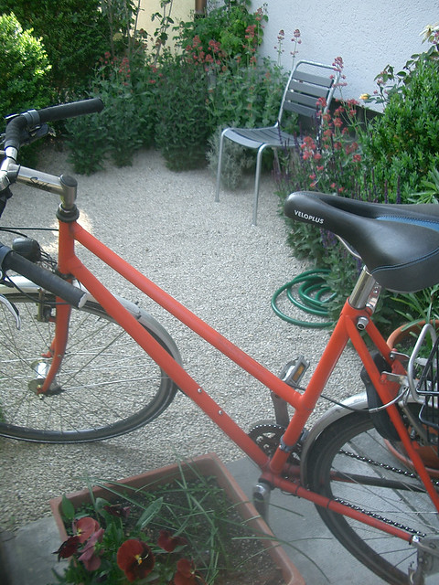
I stumbled upon this video on Erik Spiekermann while doing research on my own German lever press and its origins (and it seems pretty conclusive that it's a Hohner Hobo). Hobo bringing to mind the 1960's Schwinn bike "Slick Chick" re-painted in a VW Moon Silver after I restored it. Hohner Hobo also being a counterpart to the American C&P press. That's what I got so far.


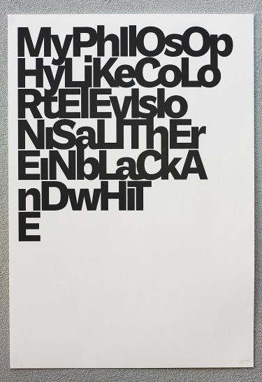
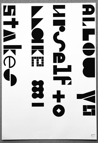
Other designer's work, travel and reading prove to be Spiekermann's greatest sources of inspiration and then re-interpreted into his own work. He goes on to say that designers are influencing each other's work and are tremendously "in tune" and speak "visual dialects". Metaphorical references are made between words and music--space and rhythm, "and just as in music, that makes it exciting!" he says, and I wholeheartedly agree.

His work includes transforming the BVG (Berlin transit passenger communication system) and Corporate Identity systems type Audi, Nokia and AT&T. I was most struck in the interview by his distinction between advertising agencies primary focus and function on the campaign compared to that of a designer's focus on communication
(openess-accessibilty-clarity). Insomma, we need a better educated culture of clients who aren't just interested in the "wow" factor.

Words, he believes, fuction as signs and proliferators of knowledge. He took for instance the internet encouraging people to read more than ever in our history. Varrying cultures of languge (be it internet, i-pad, twitter, etc...) continue to grow. His message was a positive and inspirational one that we can do things that have a profound change on the people we live with and the community we live in through visual culture. What a way to start the weekend...


Wednesday, April 27, 2011

My pretty little black press

So, I'm back and have been back for a few days. I was so anxious to get the remainder of my supplies (more to come) and still, quite honestly, roaming the Austrian Alps in my mind (those cows and not to mention awesome architecture which left me awe struck) I had yet to leave a post.

And so, I got it. I got my pretty little black press. And she's waiting there for me to try her on. But, and as I was saying, suppliers are far and in between here. But, damn if I'm not that irksome American girl... and honestly, today is like no other day, and all is well that ends well.

Pictures sent after restoration: Mechanic's workshop in Saarland, Germany

Friday, April 22, 2011

Passione [pas-sió-ne]


So, Easter weekend has arrived and I'm off to trample through four countries before coming back Easter Monday with the "Black Corsair". Funny, if not extreme, what passion makes one do. Happy Easter!

Monday, April 18, 2011

The Black Corsair (Pt. 2)

Image Via Basler Papiermuhle
http://www.papiermuseum.ch/en/the-museum/

So, I got the word last week that my Hohner lever press is ready. Now, all I have to do is go and get it, which I'm arranging to do over Easter weekend. The trip will take a scenic route through Switzerland, where there is a working printing/paper museum in Basel. Hoping to arrive just on time to get some handmade paper from the mill there!

Then, off towards Germany for the night in Saarbrucken. This area of Germany has a long history with France and shows it in their assimilation of French culture. I'm excited about trying some new dishes, and apparently they do some inventive things with the potato and serve most things with crunchy bread (like the French). Living in the north of Italy, near the Langhe hills I've come to appreciate food on an almost obsessive nature (we are slowfood nation here), but I'll leave that for other posts.

Friday, April 15, 2011

Mad Men :: House Industries


http://www.photolettering.com/ http://www.houseind.com/
images by House Industries

I thought PLINC was a sound made when you dropped a quarter in a glass, but instead it is an acronym for Photo-Lettering Inc. There was a once upon a time when Madison Avenue had its romance with Murray Hill. New York Advertising Agencies had in mind how to make it brilliant, but the other people in the know were the lettering artists in white lab coats and behind dark rimmed glasses. Now House Industries have taken a historical interest in reviving these classic letters and making them public. Thumbs up House Industries.

Tuesday, April 12, 2011

estuvo aquí // i was here

estuvo aquí//i was here

I consider conceiving the most fun part of creating,as it entails imagination and there are no limits to it. But then there is the the grimy part, which is sometimes almost impossible to do depending on where you live, resources and support available to you.
So, before the press in hand, I've created this blog and name along with it. I've even got business cards which I printed at the workshop, but no press...or letters...or ink, but ideas are flowing.

Pirouette is a state of mind. It was obvious to me that I needed a name that could be pronounced by Americans and Italians (given that's where I live), and French and Spanish too. Then there was the double sidedness to the name...to reel, to turn, to spin. I imagine my little press (to be) as a dancer on their toes doing something pretty.

Then, perhaps just as difficult as obtaining my first press (yes they exist in Europe),because they are expensive to transport (many in Germany and England), in need of repair, language barriers... is learning to communicate on this blog on a personal level. The blogging sphere is meant for this. It's easier for me to speak about art or the abstract then talking about myself. But, as I've come to understand that is what I like about other letterpress blogs (and food and interior design blogs too). The writer shares their troubles, frustrations and inspirations along the way, and you can see how things develop and grow with later posts.

It's the grime that leave its mark after all.

Sunday, April 10, 2011

Workshop In Paris // Extra Edge Dutch


Extra Edge Dutch could be the name of a new ice-cream, but instead it was some experimental printing by Thomas Gravemaker (my instructor extraordinaire) during my weekend letterpress workshop in Paris, and people he had worked with in Amsterdam.

His own teacher (and master printer) had once told him you can print anything, hence the cabbage on an earlier post.


-Linocut image and vertical leading-

Thursday, March 31, 2011

Paper = Fun

27 rue Laffitte 75009 Paris
Neighborhood: 9ème arr.

I didn't have time to visit all the super museums across the city this time around (what a pity), but I did make it into a stationary shop, Papeterie Laffitte. There were tons of beautiful totes, framed artwork, leather diaries and boxed stationary with lined envelopes of quality made paper, but my main objective was to get a notebook to scribble in while at the letterpress workshop I was attending the next day.


http://www.letterbox.fr/
http://www.letterbox.fr/catalogue/

I found a great little piece by Letterbox-Paris called "absolute note book". The outside paper cover seems to be made of wood and the title was in thermographic print. I took the plunge and spent a whopping 4.50 euros, but I'm happy with one of the very few things I brought back with me, and served its function for scribbling notes inside of.

Their online catalog is full of fun stuff too from the Paris metro map to metal boxes to scratch and sniff adhesives to posters and pulp impressions all with a vintage flair.


Monday, March 28, 2011

Cabbage // Workshop in Paris


I had the great chance to do a workshop with Thomas Gravemaker in Paris this last weekend. What an international affair as he's Dutch and I'm American crossing paths in Paris. Here's a pretty photo of experimental printing done with a piece of cabbage (yes, a cabbage!) by a gentleman he had learned from.

I'll be posting some instructional photos and videos soon.

Tuesday, March 15, 2011

Fête: DIY Hosting A Gourmand Baby Shower

In February I hosted a baby shower for ex-pat Kate. The theme of the party was inspired by Kate’s hobbies, like entertaining, cooking and photography. I thought a “GOURMAND” THEMED BABY SHOWER would be perfect.

I first designed a plant seedling as a logo and then decided to get a rubber stamp made for it (as I didn’t have my press at that point). I knew I wanted something more personalized than a digital print up. I mixed an antique rose with acrylic paints (it’s a girl) and applied the stamp to small envelopes filled with seeds to plant that spring. Finally, this envelope was put onto the cover of small kraft style notepad for guests to write down notes during the event.


Other stationery (that doubled as PRIZES) included DESIGNED RECIPE CARDS with Kate's favorite's like "Easier than Julia Child's Caesar Salad" and "Spinach Artichoke Dip,1960's Style". Another prizes included MATTED FOOD PHOTOGRAPHY of homemade pasta, fresh beans or nashe (a hybrid of pear and apple) by Kate. These matted pieces were then attached with a favorite quote and wrapped up with rustic string printed on cardstock.


Angie

I kept DECORATING SIMPLE and made about a dozen of the queen of DYI Martha Stewart's paper pompoms...a nice background effect inside barrel vault brick ceilings. The catering was done by La Bottega Errante  which supplied simple finger foods and local bottled wines.


THE GAMES kept the party fun and full of laughs. These included the classic blindfolded type games as: FIND THE BABY PENS IN A JAR OF RICE, FEED THE BABY (beware, this one can get very very messy--best to wrap a trash bag around person getting fed as the person feeding the “baby” is blindfolded), TOSS THE BABY WATER BALLOON (another messy one--decorate it with your baby’s face and you and your partner are more likely not to drop it)! 
DSC_1416

Yum

proud parent winners

The GUESSING GAMES were interesting too...make a list of little know facts about the guest of honor and find out just how well her friends know her...

party photography by Maria Zanon and Roxy